I was recently commissioned to paint a picture of Mount Hosmer and naturally the Fernie Ghostrider. Here is my original painting the lady saw which she liked:
Often times when I get a commission I tend to freeze up. It’s a lot of pressure to paint a commission and it can give you “painter’s block” if you don’t mitigate those feelings. Why is it so much more difficult to paint a picture for someone else than for yourself? For one thing it is hard enough to “get it right” when you’re painting from your own vision, but it’s very difficult to paint what’s in someone else’s head.
How do you know if this is what they had in mind?
What if they don’t like it?
Can I use my painter’s intuition or do they want it to be “just so”?
What is “just so”?
Questions like these and more can float around your head and block the creative flow.
Well, last weekend I heard a suggestion that may change the way you think about commissions forever. I was taking Alex Fong’s watercolour workshop, The Magic of Watercolour, and he was talking about commissions. He said that his trick to take the pressure off is to paint three different versions of the commission and then give the client a choice.
“Paint three?” you may be asking, “isn’t a commission hard enough work in the first place, let alone tackling it three times?” Yes, a commission is hard work, but part of the hard work is the struggle with the mental block of painting a commission. Imagine how much easier the paint would flow if you could lift that block and paint without any of the associated pressures of painting a commission. It would be freeing.
Painting three paintings can take longer than painting one, but I have always found that in painting multiple pictures I tend to improve as I go. You will start to see shapes better. You will loosen up and carry your brush with a lighter touch using bold confident strokes. Here is a chance to learn and grow as an artist.
Your client will be impressed that you have provided them with three choices. Plus, as Alex says, it alleviates that awkward pause while you’re wondering “do they like it? Gosh, what if they don’t like it?” when the client first sees your finished piece. This way they have a choice, they can pick their favourite. It actually takes the pressure off the client as well who may be asking themselves “Will I like it?”, “What if I don’t like it?”, “What will I say?”.
I have tried this approach a few times before and it has worked great. My clients have been thrilled and once I even sold two pieces instead of one!
Here is my latest commission which I actually painted four times. Which one do you think she will choose?
Last weekend I painted this Winter Stream watercolour painting. Here are the steps I took to create it…
1. Underpainting
First I wet the entire paper and did a wet-in-wet wash (the brush is full of wet paint which flows into the wet surface of the pre-wetted paper) using cobalt blue, raw sienna and permanent rose.
I was careful not to cover the entire surface of the paper with colour so that the wash would incorporate some white sweeps (simply the wet paper). I was also careful not to use too many brush strokes which would have blended the colours together not only dulling them but creating a flat wash. I wanted the paper to sing with light and colour.
2. Misty Background Trees
Next I waited for the paper to completely dry and then I painted in a soft layer of misty tree shapes in the background on the right, seemingly the ones which are going to be behind the stream as it curves off to the left of the viewer. What I’m actually painting isn’t the trees themselves, I’m painting what will become the shadowed snow on the tree branches, so I’m careful to paint softly and leave some light areas.
In the spot where the sun is going to be catching the branches I use raw sienna rather than the cobalt blue / permanent rose mixture and I leave some white areas. Notice how I didn’t paint the trees right to the bottom branches; I used rounded shapes to give the impression that the trees are sitting behind snowbanks.
3. Add Contrast
To add drama I now begin to paint the darker shades on the trees using loose flowing brush strokes with purposeful yet random ‘holes’ to represent the snow on the trees.
I have prepped several colours and I alternate which puddles I dip into as I paint so that the trees will have some life to them and not be one flat shape. Some of the colours I have prepared are cobalt blue, permanent rose, dioxazine purple, hunter’s green and indigo. The colours sit next to each other on my palette and they tend to run into each other too so it creates some nice shades and nuances.
Another artist asked me how I paint such exact shapes. Actually I am not painting each individual shape. I am using a photograph for reference but in the process of trying to capture the essence of the snow on the trees I am also moving my brush in a rather helter skelter way so that my painting will still look like a painting.
4. Paint Around Important Mid-Ground Shapes
I’ve decided that I’d like to paint a tall leafless tree on the right side of the painting for balance. I want it to look like it has snow on it so it’s important that I establish the shapes before I paint in the dark shadows on the background trees.
Since this scene is backlit I paint in the snow which will go on my new tree using combinations of cobalt blue and permanent rose. When it’s dry I add the branches under the snow and I continue painting the dark sweeps onto the background trees, careful to paint around the branches on my mid-ground tree.
5. Tackle the Water
The water is a lot easier than it looks but it may take a bit of practice. I very lightly drew in my stream with pencil so that I would have an idea of where the water was to go. I don’t always draw first but with this process I am going to need to be quick so there will be no time to hesitate part way through.
Once I start painting the water I must stay within the area of my stream. I did not wet the paper first. I used a lot of paint and made sure that it stayed nice and wet as I worked from the top of the stream to the bottom. Since the stream is broken up by a bar of snow I treated the top and bottom as two different sections. I didn’t want the top part to dry while I was working on the bottom part or vice versa.
In order for the reflections to work out I needed the paint to still be wet. So as soon as the top shape was completely filled in I immediately dripped in some verticle swipes of very dark indigo. Then I mixed some white acrylic paint with a tiny bit of water and dropped in a few delicate vertical stripes. Perhaps the most important part of this is that once I laid in these colours I did not touch it any further. I let the paint do it’s thing.
The bottom section of the stream I painted a little differently than the top, only because it was bigger and I was afraid it might dry before I could get to the vertical stripes which create the illusion of reflections. Switching from one colour to the next I filled the stream shape with overlapping vertical stripes which were wet enough to blend seamlessly together yet not too wet that they lose the vertical feeling.
I worked quickly and then again while the stream was still quite damp I brushed in some vertical stripes of watered down acrylic paint. Not too watered down mind you because then it would have backwashed into the paint and caused some blossoms.
To remind the paint that I wanted it to stay in this vertical pattern I tilted my paper up so that the paint would run vertically and not pool sideways.
Finally I added some deep indigo just under each snowbank while the paint was still slightly damp. This let it bleed just a bit and it visually lifts the snow off the water just a teeny bit.
6. Complete the Water Illusion by Creating a Surface
The water now has beautiful reflections but this will sometimes unwittingly draw the viewer’s eye right off the bottom of the page. Where does the water stop?
Let’s create the illusion of the stream’s surface which will immediately give the water incredible depth and at the same time keep the viewer’s eye well within your painting.
For this step to work your water has to be dry or very near dry. Using a slightly damp or nearly dry clean brush, ‘draw’ a few horizontal lines across the surface of your water. Gently dab the line with a paper towel if it didn’t lift on it’s own. By lift I mean that the pigment lifted off the paper leaving a pale white line.
Be careful not to over-do this step. It is so much fun and so effective that you might get carried away and if you have too many lines it can be distracting and actually take away from the overall illusion. Just a few will do.
7. Liven up the Darks
Once I finished the darks on the trees I realised that they were quite overwhelming and a bit dead, void of light. To liven them up I dropped some Holbein Grey Blue into the bits which were still damp. Holbein Grey Blue is a chalky blue opaque watercolour so it can stand up against the rich darks. This was not a planned step in my painting but I love what it did for it.
8. Add Form to the Snow
In the above picture the water is believable but the snow appears to be flat as if covering a concrete surface. In nature snow is undulating and poofy; it has form. The magic happens when you add shadows to the snow. Using a lost and found line paint the top surface of a snow pile and then with clean water bleed out the top edge so that the shadow has gradation. A shadowed edge along the side of the stream virtually lifts the snow above the water and creates snow banks.
9. Calm the Distractions
A successful painting will have an area of focus and draw your eye around the painting. You can sometimes pick out problem areas or distractions by squinting at your painting.
Squint at the above picture and what sticks out to you the most? For me it is the bright snow on the branches of the trees on the left. This creates two problems: one, those trees should actually be in shadow, they are too bright which betrays the direction of light, and two, they are distracting the viewer’s attention away from the main focus which is the light shining down on the stream.
Using a soft wash of cobalt blue and permanent rose I can gently eliminate this distraction and direct the eye to the area of most light (which in hindsight I wish I had put more to the right and not so close to the centre of the painting, but that’s another topic).
10. Be Brave Enough to “Wreck it”
When this painting was at the above stage I was unsure if I should call it done. I really felt like it would be fun to add some lightly falling snow, but at the same time I was afraid to ‘wreck it’. When you’ve come this far it is a little scary to start dripping paint over your painting.
Luckily for me I was taking a watercolour workshop and I asked my classmates if I should add snow or not. The response was 50-50, half said snow, half said no. So to break the tie I deferred to the expert, our workshop instructor Alex Fong. His response delighted me. He said “Of course! Everything needs a little snow. Just Go For It!” I’m sure glad I did since the snow really lightened up the dark areas without distracting from the focus and gave life and movement to the painting.
If you feel that your painting needs a little extra something, have fun and just go for it! When you are brave enough to “wreck it” you can sometimes luck out and get beautiful results.
I had a lot of fun painting this winter water scene. I hope you enjoyed seeing the steps I took to create it. Please reply below if you have any comments or questions. Thank you!
Tonight I attended a “Search Engine Optimization For Entrepreneurs” seminar put on by the Okanagan Valley Entrepreneur Society (OVES).
It was a great talk and the discussion exceeded my expectations. There was a packed house and the discussion format was a moderated Q&A with 3 expert panellists:
The Top 3 Keys for good SEO (Search Engine Optimization ie. improving how you rank on search engines such as Google and Bing) that were discussed tonight confirmed what I already suspected:
SEO Must Haves
Relevant High-Quality Content
Quality Incoming Links from Relevant Sites
Regularly Updated Relevant Content
Notice that the common theme in improving your SEO is to be RELEVANT!
Search engines such as Google are wising up and are no longer fooled by keyword stuffing (overuse of keywords which aren’t relevant to your content), paid links (paying sites to link to you), or other artificial “black hat” (spammy or unethical methods of trying to increase your page ranking) tricks.
By the way, a fourth key element which is not always at the top of everyone’s radar, but was brought up tonight by the panellists as another must have for good SEO, is:
4. Keyword Rich Relevant Title Tags
Some other important points that were emphasized tonight were:
SEO takes time
be as authentic as possible
stay on top of it
define specific goals and targets
create a niche market
make your site authoritative on your subject
I learned a lot tonight (10 pages of notes worth!) and it just makes me want to learn more. If you would like to find out more about the seminar I attended or the panellists, visit the event Search Engine Optimization for Entrepreneurs info page on the OVES website.
Feel free to contact me if you’d like to set up a consultation on your website and help improving your SEO. If you have any suggestions or observations, please comment below. I’d love to hear from you.
In my previous post I mentioned that the Artists for Japan fundraising initiative switched from a facebook group to a fan page. Now you may be asking yourself what the difference is between a group and a page and why we would risk losing our following by moving. At the time of the move the group had well over 700 members! Well, we weighed our options and the pros of using a facebook page happened to outweigh the disadvantages.
Let’s compare facebook groups to facebook pages from our experience:
Facebook Group
Pros:
In a group all members can directly add their friends to the group using a link in the right side bar. The group grew in leaps and bounds as each new member added their friends who they thought would like to donate art or bid on the art. It’s possible that our cause may not have gone viral as quickly if we had not used a group to start it out. In just 10 days we grew to over 700 members!
On a group wall the post with the most current comment appears at the top. When you go to a group wall, you are always in the thick of the action. It’s easy to see where the conversations are happening. It was fun to see some of the bidding wars and this group feature allowed us to watch the action as it happened. Without this feature we may not have been aware of much of the activity happening on the wall.
When you belong to a group you can add the group to your left side bar on your home page which makes it very easy to access. No searching around to find the group.
Cons:
When you join a group you are automatically ‘signed up’ for email notifications for all posts and comments. This can be very overwhelming, especially when the group is growing in leaps and bounds and you aren’t sure how to turn off the emails. PS if this ever happens to you, it’s easy to remedy, just go to the group page, click the ‘edit settings’ button on the top right, and you can choose which if any emails are sent to you.
In a group all members can directly add their friends to the group using a link in the right side bar.This means that people can be added to the group without even knowing anything about it. If they aren’t sure why they are added, there’s a possibility that it could feel like spam.
Since the posts are constantly changing order (the post with the most current comment appears at the top) it is hard to keep track of posts and find the auction items when needed
It’s hard to find the group if you aren’t already a member
There are no links for the Photos so you have to click on a photo and then scroll from there
On a group the admins can only comment as themselves so it is difficult to show official posts
it’s difficult to share photos because there is no share link (you have to manually copy and paste the URL from your browser)
the share button for the group is at the very bottom of a group wall so you have to scroll down, waaaaay down, to find it
These points are only gathered from my personal and recent experiences and are not intended to give a full overview of facebook groups. To read more about how groups work and find out if a group is right for you, read this informative article (including a video) from Mashable.com: New Facebook Groups.
There are quick links in the left side bar for Info, Photos, Notes, Events
Admins can comment as the page profile or as their personal profile thus distinguishing official wall posts from personal ones
With new pages you can now receive notifications for page activity!
Non-admins will NOT receive emails. Yahoo! (and for the admins of a page it is easy to turn off notifications, just go to edit page and click on Your Settings
When you login as a page admin, you can spread the love and create awareness for your page by
‘liking’ other pages as your page profile
comment on other facebook pages as your page profile
There is a share link for every photo so it’s easier to post the art for auction on your personal profile
You can make a profile banner for a Page (you just can’t control the order of the pics like you can on your personal profile)
Cons:
It will take longer to get established since the page will grow organically as people must opt in manually by clicking the ‘like’ button
Facebook took away the ‘suggest to friends’ link on pages, so it’s not as easy as it used to be to promote a facebook page
I’d love to hear your thoughts. These observations are from my experience only, so please let me know what your experience has been and if you have anything to add. Thanks!
I was inspired by Dora Themelis to write this post. (You can find her on twitter at http://twitter.com/DorasPaintDrips.) I commented on her post about painting with watercolours where she compares two wonderful portraits she has done. Thinking about the importance of the materials behind every artist prompted me to write more of my own experience in a blog post as well.
Watercolours aren’t easy at first and especially for complicated subjects. The more detail you are adding to a painting the higher the possibility of roughing up the paper surface causing streaks, lines and smudges to appear in your painting. This is very discouraging for the beginning artist and can deter some people from painting with watercolours. Watercolours are known for their pure luminous quality so it is extremely frustrating when all you end up with are dull overworked paintings.
It can take a lot of practice painting layered transparent washes but with the right paints and techniques it is possible to end up with a glowing rich painting. I also believe that the paper you are using can make a world of difference.
For example, a heavier paper would make the whole process so much easier. I use 300 pound cold press paper and it really helps. It’s hard to explain how much difference a paper can make but it can truly be a huge factor in the success of the painting. The cold press paper has a rough texture which gives the painting a “tooth” for the paint to grab onto which is great for dry-brushing texture such as ice, bark, pebbles, a roof, etc.
The weight of the paper makes it less susceptible to curling and puddling. It also makes the paper more forgiving which means you won’t be as likely to rub off the surface fibres of the paper as you apply multiple brushstrokes in one area.
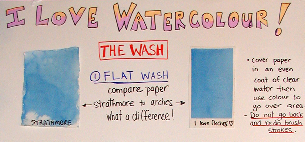
It’s also important to note that the brand of paper you are using can also a big difference which in my opinion can be night and day. I love Arches paper. The colours seem to blend a lot smoother. It has just the right amount of sizing which is applied to these cotton papers so that they won’t absorb the water too quickly. I guess it kind of protects the paper from getting waterlogged in a way. I have used other papers which have been nearly impossible to paint a smooth clean wash on without getting streaks or run-backs, cauliflower like stains in the painting.
Here is an example of two washes I made using 140 pound paper of two different brands. I used the same technique in both examples.
As far as painting styles you will develop your own as your familiarity with the medium increases. Watercolour can be frustrating for sure, but I absolutely love the medium. When I lay down the perfect wash it makes my heart sing.
In January I was a guest artist at the Sun Peaks Winter Wine Festival. To attract people to my table I demonstrated intriguing watercolour techniques using ordinary household items.
I can’t say I ever had a massive crowd lined up at my table; however, one man did wait 15 minutes to find out how to paint a birch tree with a fork! In fact, the organizer of the event came and told me that people were talking about my birch tree with a fork demo all the way up the village!
Here I will share with you the tricks behind the techniques: the unveiling of the magic!
1. How to Paint a Birch Tree with a Fork! The first step is to paint in the background around the area where you want your tree to go, leaving that part white. Next, wet the paper along the tree trunk and drop in your shadow colours. Then use the handle of the fork to create the birch bark along the tree by pushing it into the paper and dragging it across the tree in various parts of the trunk. This will cause some of the paint to be lifted revealing the white birch, and some of the paint to seep into the crevasses which makes the dark lines of the bark. You can then dab in a few drops of dark paint for contrast. If you paint in any branches, use one of the prongs on the fork to scratch along the branch to create texture.
2. Turn Salt into Snowflakes! This one is so fun, and literally quite magical.
As with the birch tree you must save your whites, so paint your background colour around any white areas, such as the snowmen in this example. While the paint is STILL WET, sprinkle some salt onto the painting.
At first you won’t notice any change, but slowly as the paint dries the salt will absorb some of the water and as it does it will also draw some of the colour towards it. This will leave magical little snowflakes in their wake. The wetter the painting when you drop in the salt the bigger the snowflakes (you can actually get quite a blizzard going), and the drier the paint the smaller the snowflakes will turn out, which works great if you are trying to create stars in the sky!
3. Paint Under Water with Cellophane! To clarify, I am not actually putting the paper under water and then painting it using cellophane. This is what my dad thought when he read my last blog post. I thought about changing the title to be more clear, but then since the purpose of my titles was to intrigue people, and my dad was immensely curious, I decided to leave it. What I am actually doing is painting an under water scene with the aid of cellophane.
This is also very fun and a great exercise for giving up control since you never know how it is going to turn out. What you do is paint on your background very wet.
Make sure the paint is a lot darker than what you want it to be since a lot of the colour will be lifted off by the cellophane which you then place over the painting.
Press the cellphane into the wet paint and then let it dry. When you peel it off you will see the abstract pattern that it created in the painting. In this case it is meant to represent the light refracting through the water.
4. Use a Candle to Make a Moonlit Reflection In this exercise take an ordinary white candle (I used a tea light) and rub it gently over the dry paper where you want your reflection to appear. This is a little like using a magic pen to write a secret message which will not be revealed until you paint over it (another great idea for a demo!).
Since you want your horizon to lay flat it is imperative that you use horizontal strokes to create the reflections. The harder you press the whiter the reflections will be. Make sure you don’t get any candle wax above the edge of the water since you won’t be able to cover it up later. Now you simply paint your picture. The darker the colour you use for the water the brighter your reflections will appear.
In this case I waited for the paint to dry and then I used a damp brush to scrub some extra vertical highlights to make it really sparkle.
5. Turn a Carrot into a Person!
I can’t remember where I learned this trick but it is the best thing for painting natural looking people walking in your landscapes. This one works just like it sounds. First you paint a carrot. It doesn’t have to be orange, but I made this one orange for good effect. Don’t paint the greenery (unless you are painting someone in a Mardi Gras parade). Next add a head. Don’t paint the neck or it will look awkward. That’s pretty much it, but then it’s up to you if you add arms or props like skis and poles!
Here is an example where all the people started out as carrots:
I can’t say I had as many onlookers as I hoped, but I can say that I certainly garnered a lot more interest due to these tips and tricks using everyday items. I also had a free draw which helped attract people over to my table. The highlight of my whole weekend was the delighted reaction from the grand prize winner. She couldn’t have been happier and that absolutely made my day.
Here I am with the winner of my Sun Peaks limited edition giclee.


 In January I was a guest artist at the Sun Peaks Winter Wine Festival. To attract people to my table I demonstrated intriguing watercolour techniques using ordinary household items.
 The first step is to paint in the background
  This one is so fun, and literally quite magical.
 To clarify, I am not actually putting the paper under water and then painting it using cellophane. This is what my dad thought when he read my last blog post. I thought about changing the title to be more clear, but then since the purpose of my titles was to intrigue people, and my dad was immensely curious, I decided to leave it. What I am actually doing is painting an
  In this exercise take an ordinary white candle (I used a tea light) and rub it gently over the dry paper where you want your reflection to appear. This is a little like using a magic pen to write a secret message which will not be revealed until you paint over it (another great idea for a demo!).


